Soft branding for little beginnings
A friendly and colorful identity for baby food products

This project was created for a startup company from Serbia that initially launched under the name Biraj Zdravo, and was later rebranded as BabyMeals. The goal was to build a complete brand identity from the ground up for a business focused on producing healthy baby food meals.
The branding process started with the creation of a core symbol — a stylized, hand-written lowercase “b”, placed inside a soft, flowing circular shape. This icon was designed to feel warm, friendly, and approachable, perfectly suited for a baby-focused brand. The full logo combines this symbol with clean, readable typography, maintaining a balance between playfulness and clarity.
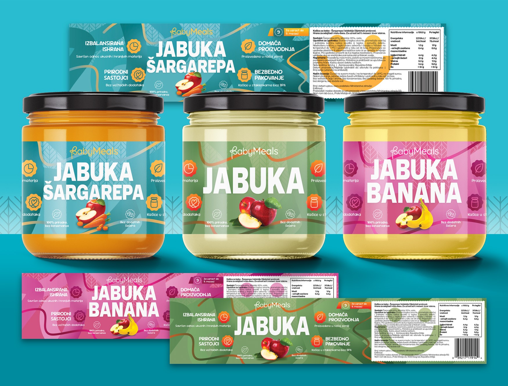
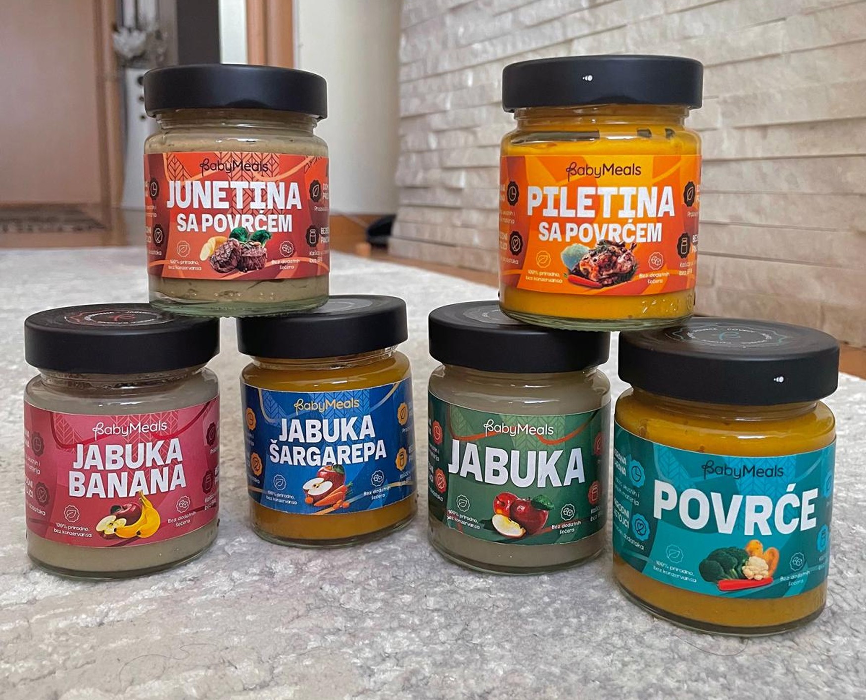
In addition to the visual identity, I designed product labels for the jars, using bright, colorful, and joyful tones to make the products stand out on shelves. The labels were crafted to feel safe, cheerful, and appealing to parents, while still being visually engaging and modern.
The result is a gentle, recognizable brand identity that supports BabyMeals as a trustworthy and friendly choice for children’s nutrition.