A complete visual identity designed to represent speed, reliability, and professionalism within the logistics industry.
The project included logo development, color palette creation, brand variations, and practical applications across digital and physical touchpoints.
Prime Delivery required a visual identity that could communicate the company's core values of movement, balance, and reliability. The objective was to create a professional brand presence capable of working across vehicles, digital platforms, uniforms, and marketing materials while remaining recognizable at every size.
The logo was built around the initials P and D, mirrored into a symmetrical mark that creates a strong and memorable visual foundation. Integrated within the symbol are two directional arrows, representing transport, delivery, and continuous movement. Inspired by origami, the mark combines sharp geometric forms and multiple shades of a single color to create depth without relying on gradients.
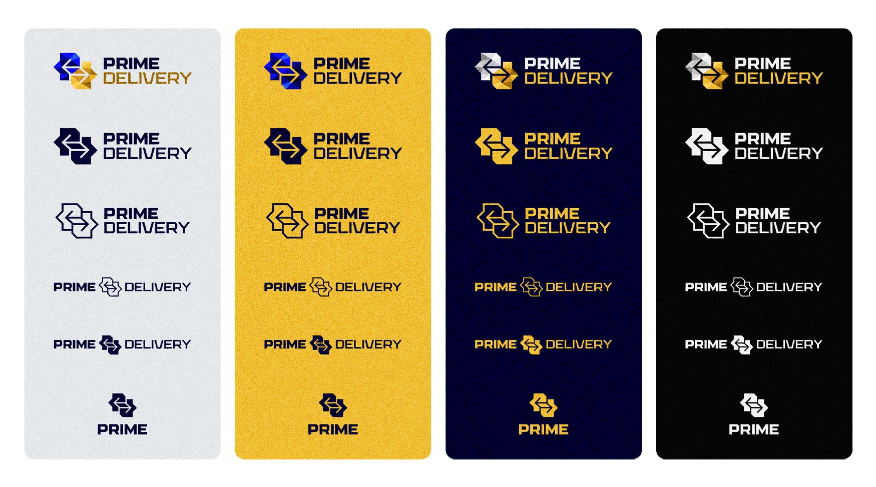
A carefully selected color palette of navy blue, vibrant blue, white, and golden yellow reinforces both trust and visibility. Multiple logo variations were developed to ensure flexibility across different backgrounds and use cases, including full-color, monochrome, inverted, and icon-only versions.
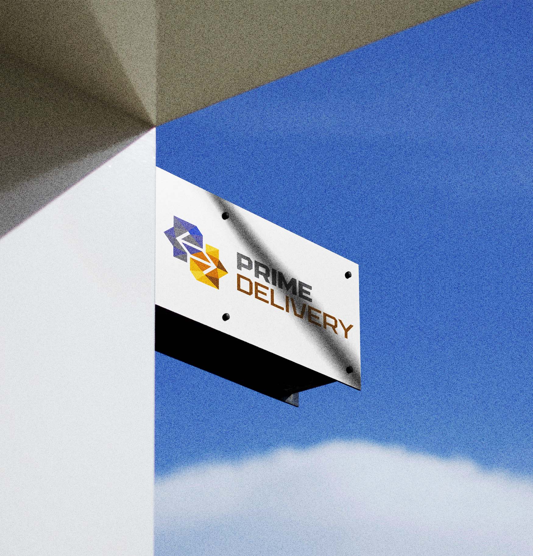
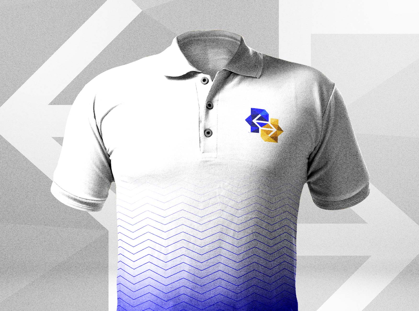
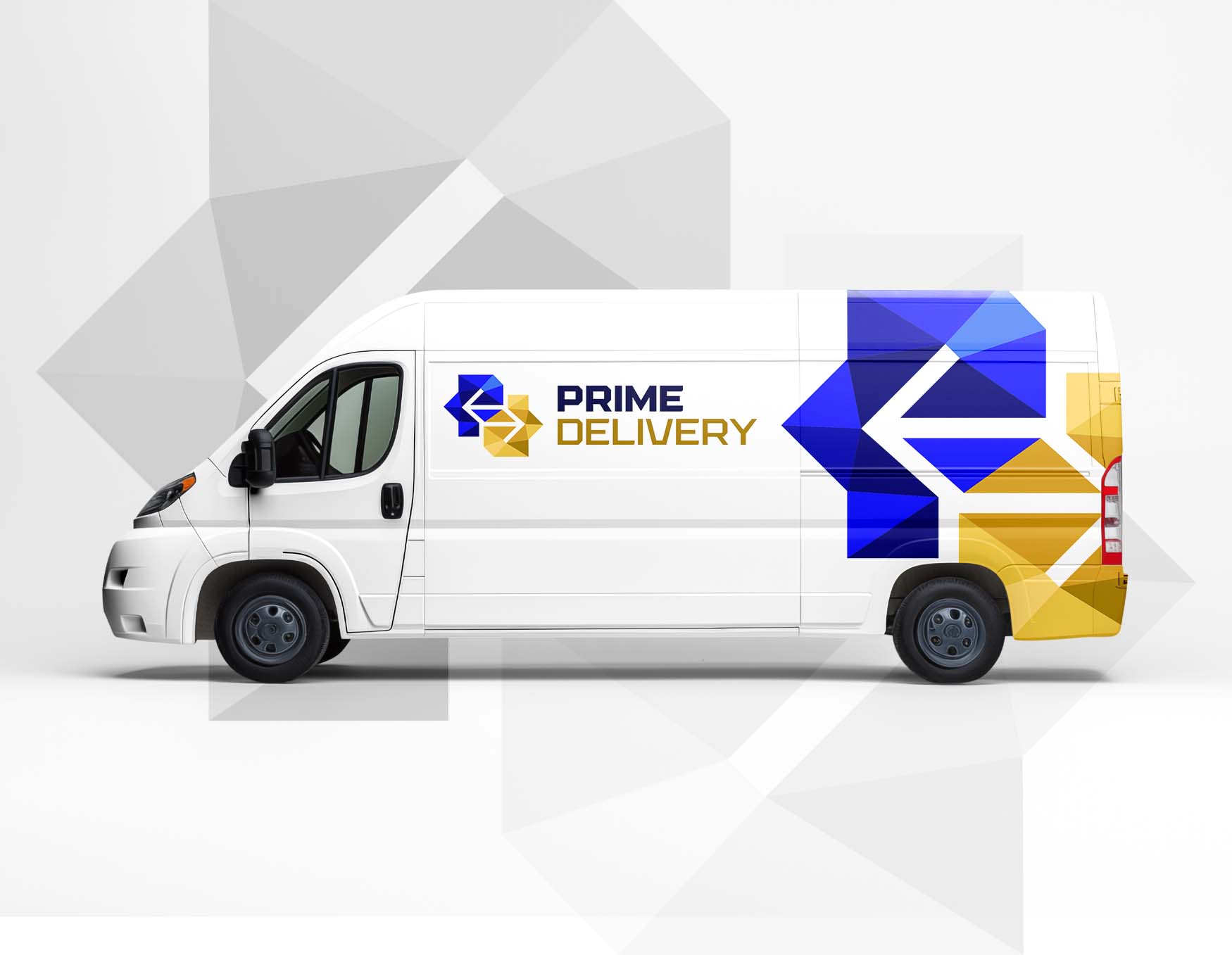
The identity system was designed with scalability in mind, allowing the brand to remain effective across mobile applications, uniforms, company vehicles, signage, and printed materials. Supporting mockups demonstrate how the logo maintains clarity and recognition regardless of format or environment.
The final result is a modern logistics brand identity that combines strong symbolism with practical usability, providing Prime Delivery with a professional visual system capable of supporting future growth.