A flyer redesign created to present Telesky's internet and television services in a clearer and more engaging way.
The project focused on reorganizing package information, improving readability, and creating a more modern layout while maintaining the brand's existing visual identity.
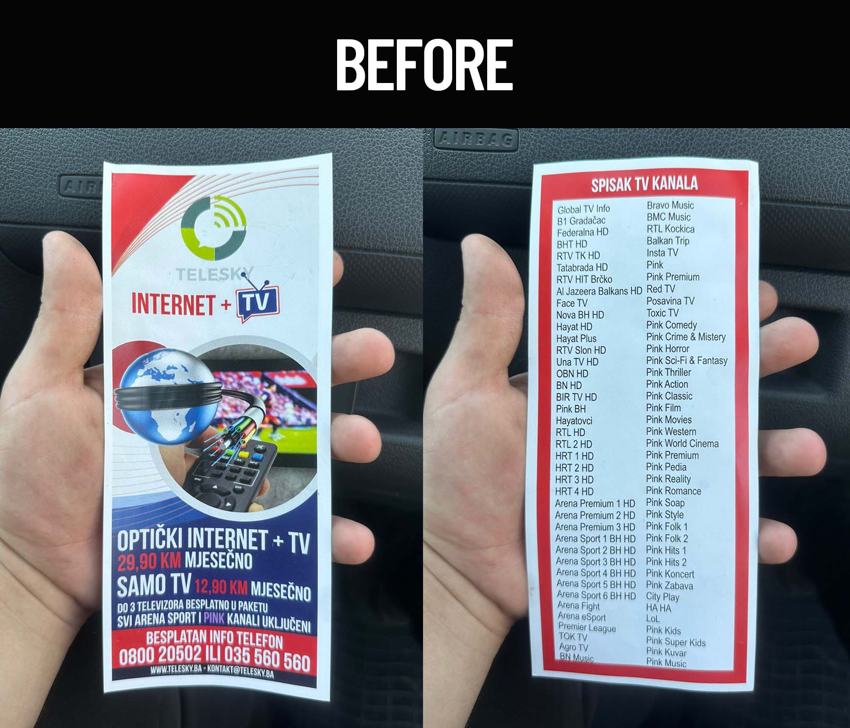
Telesky needed an updated promotional flyer for its internet and television services. While the original version contained all the necessary information, the layout made it difficult to quickly identify package details, pricing, and key benefits. The goal of the redesign was to create a cleaner and more organized marketing piece that would communicate the offer more effectively.
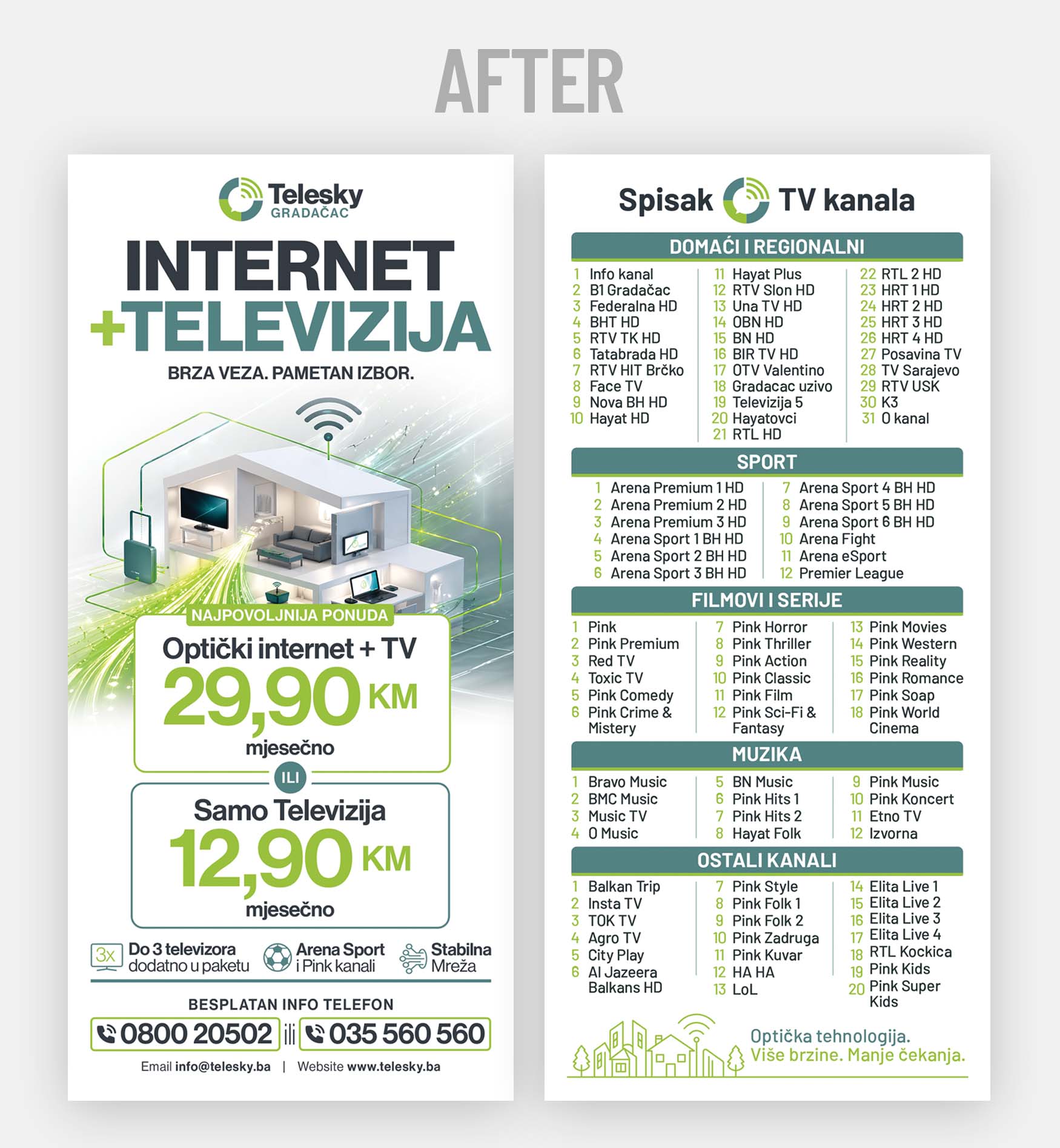
The redesign focused on improving information hierarchy and readability. Package pricing was given greater visual prominence, while supporting content was reorganized into clearly structured sections. Typography was simplified and spacing was refined to make the flyer easier to scan and understand at a glance.
The existing brand colors were retained to maintain recognition, while the overall visual presentation was modernized through cleaner layouts and more consistent use of visual elements. The reverse side was reorganized to present TV channels in categorized groups, making the information easier to navigate and compare.
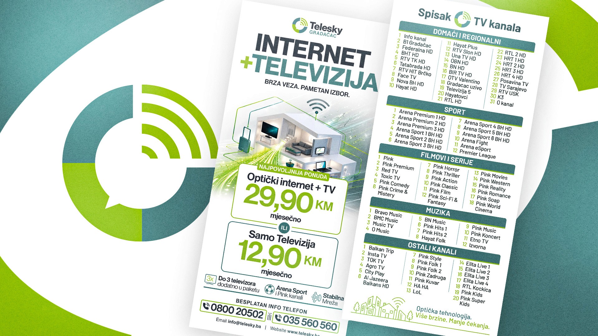
The final design delivers a more professional and accessible presentation of Telesky's services. By improving clarity, organization, and visual balance, the flyer allows potential customers to quickly understand available packages and key benefits while reinforcing a stronger brand presence.